
Brand and User Design & Visual Storytelling
Brand and User Design & Visual Storytelling
This is a case study in brand design and storytelling, where I explore how visual choices — typography, color, composition — can express personality and invite engagement.
To me, branding is like poetry: distilling an essence into something memorable yet understated.
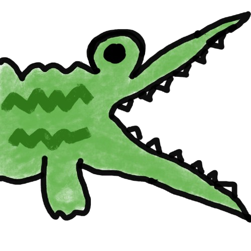
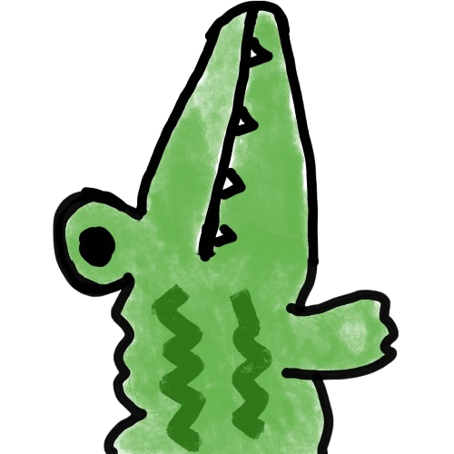
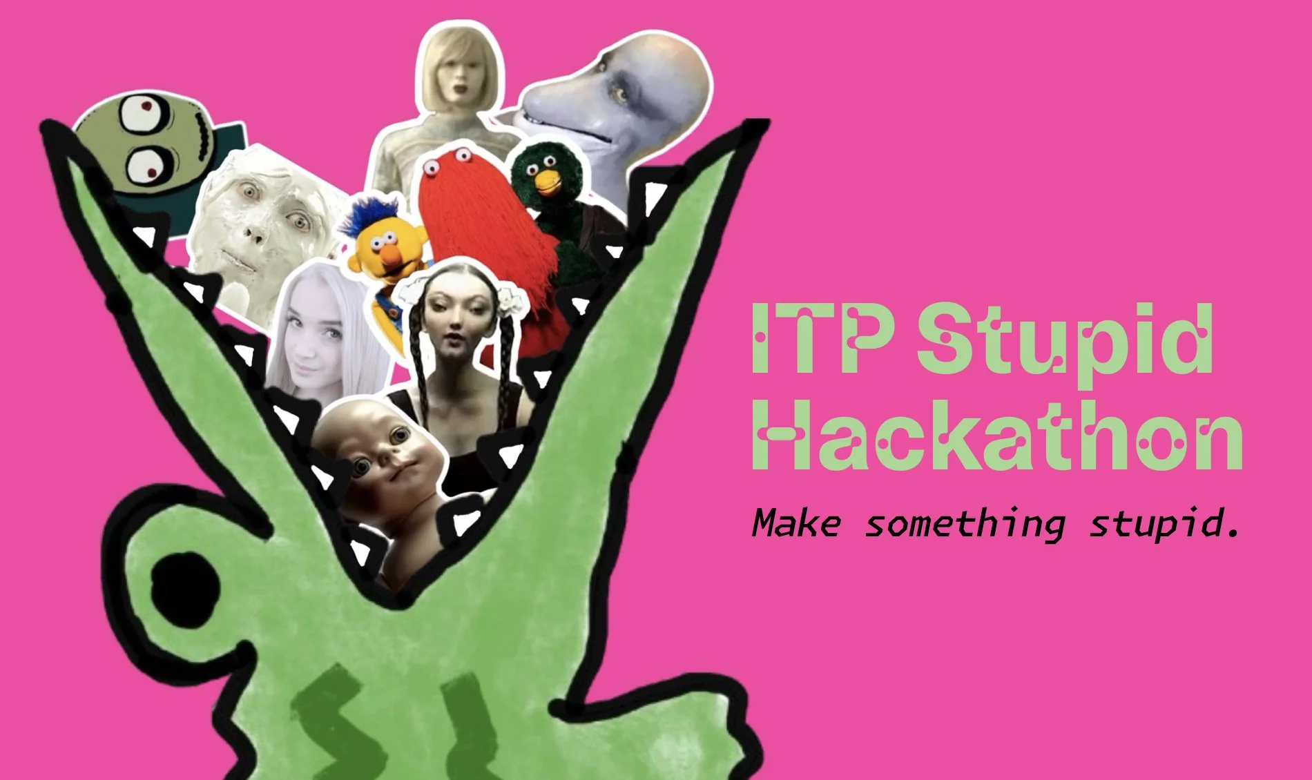
Stupid Hackathon 2025: Janky Meets Chic
For the ITP Stupid Hackathon, a tradition of chaotic humor, my challenge was to:
Keep the spirit of absurdity, but polish it slightly to make it feel intentionally irreverent rather than just messy.
Key decisions:
Typography: Used Dinamo’s quirky yet legible type to hint at playfulness without sacrificing readability
Color palette: Bright, contrasting accents over muted backgrounds to maintain energy without overwhelming
Composition: Layered text and elements to feel spontaneous, while maintaining grid alignment underneath
Delivery: Ensured accessibility by testing readability across mobile & desktop
Result: posters, digital banners, and a website that felt true to the hackathon’s chaotic spirit while elevating the visual language slightly.


What I Learned:
The importance of thinking beyond the “pretty”: how typography and color impact readability, tone, and user trust
How brand identity decisions translate into UX: users understand and navigate better when visuals reinforce messaging
The value of testing designs on actual screens (not just on Figma or print)
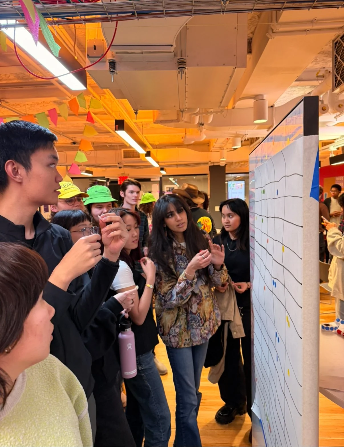
How to bridge design and development: building the Stupid Hackathon website myself in HTML, CSS, and JavaScript taught me how to translate design into functional code, and how to communicate seamlessly with both design and engineering teams


Compared to typical hackathon websites that rely on minimal text and plain event schedules, this site’s bold branding and playful interactive elements stand out — embodying the irreverent spirit of the event while keeping navigation clear and user-friendly. I began the design process by creating moodboards and wireframes to explore visual directions, then developed mockups in Figma that balanced clarity with personality. Once the design was finalized, I personally coded the site using HTML, CSS, and JavaScript to maintain fidelity to the vision and ensure a smooth, responsive user experience.


Personal Branding: Finding My Own Voice
Designing for myself has been harder than for anyone else.
I started by asking:
What do I want people to feel when they see my name? Confident? Playful? Quietly bold?
My first logo didn’t feel right — it felt forced.
So I revisited the basics:
Typography: clean but soft; letterforms that feel approachable
Shape: minimal but distinct
Negative space: letting the design breathe
Color: inspired by the muted, warm palette of the clothes I wear daily — browns, creams, deep greens
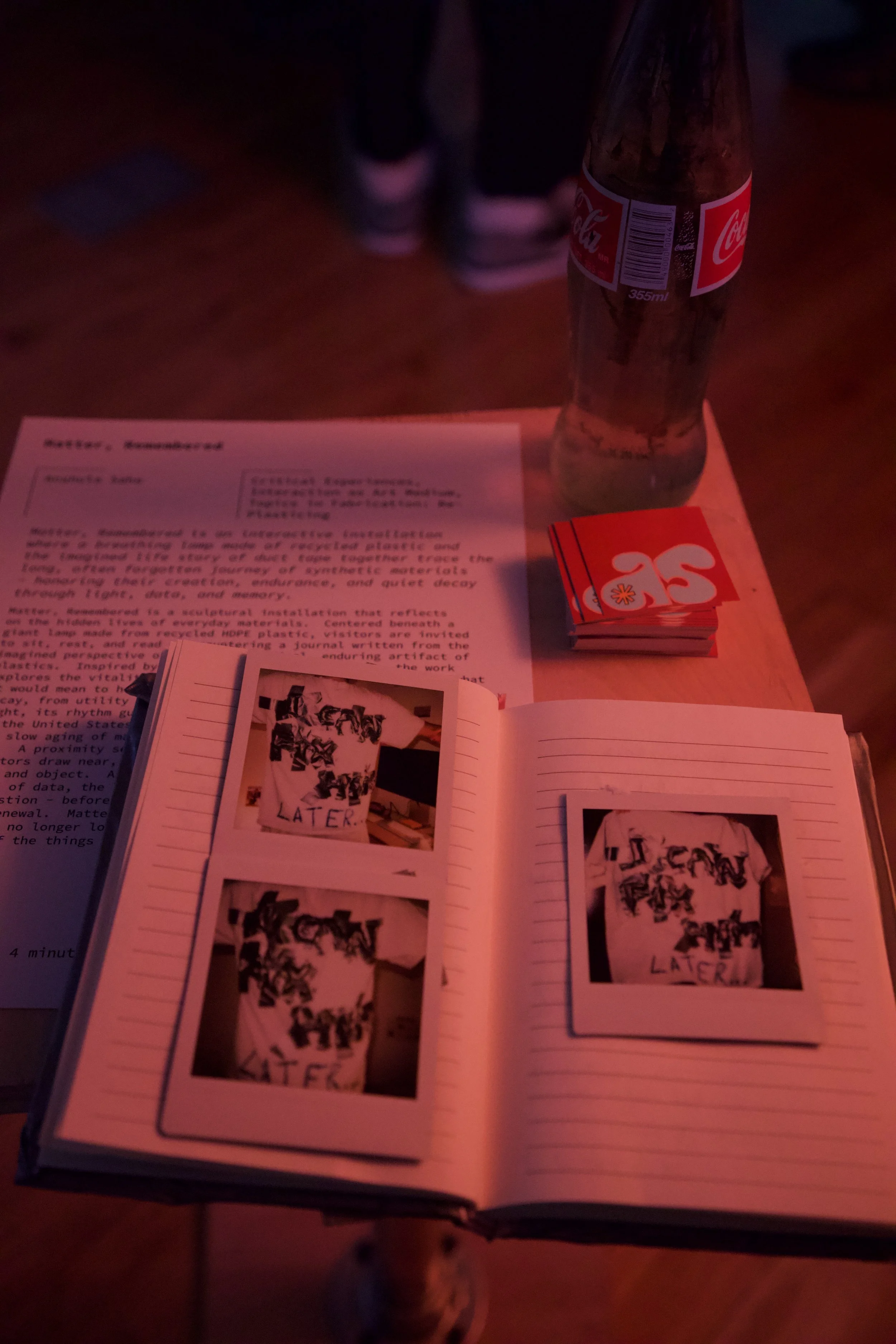
I’m still iterating, but here’s where I landed for now:
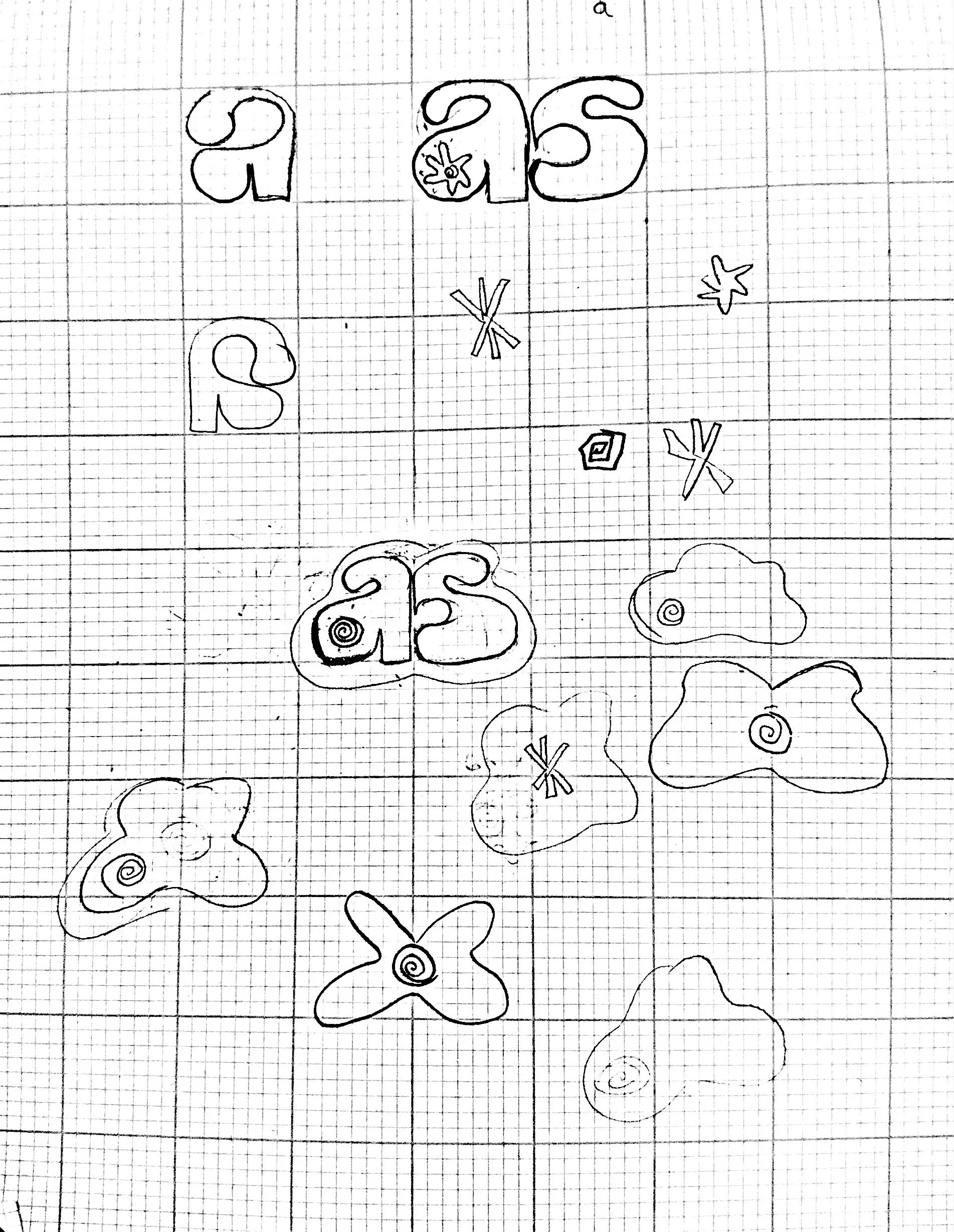


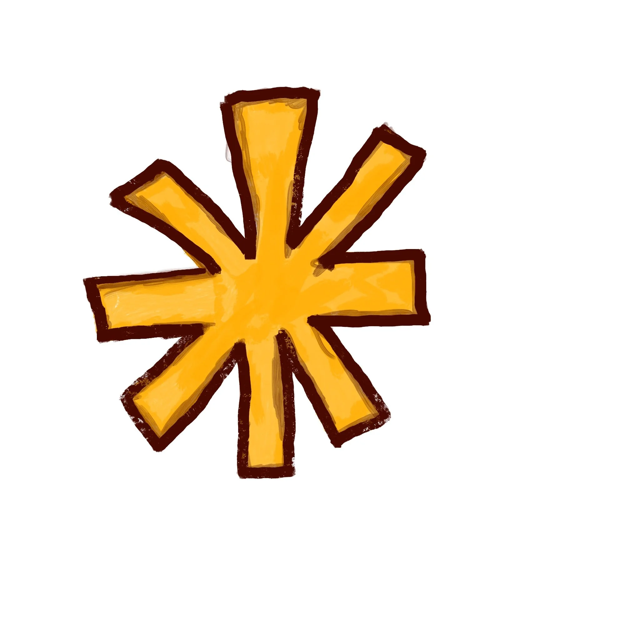


These are also some fun glyph pattern I created with the first letter of my name


Tenant Association Posters: Community-Focused Design
For my building’s tenant meeting posters, my goal was to create a sense of local activism & urgency without looking corporate.
Inspired by Dinamo’s humanist typefaces and bold color contrasts, I leaned into a raw, DIY feel that was still clear and impactful.

